This will be my last post about design. There are no pictures needed for what type of design I am going to talk about because you cannot quite capture the new world's culture. This is not design as thought of like the color of a room, or the lines on a car. This is design based on the world that we live in. The design of our lives and what our culture is currently creating. One of the meanings of the word design is organization or structure of formal elements in a work of art; composition. That is the meaning when you use the word as a noun. Design in general. What about the design of our world? The world itself is a work of art or a canvas that we are all currently painting. I feel that we almost had it ruined but, with the current green movement we are pushing back the end. This is a piece of art that will never be finish but, will always be added too. One idea of design I'd like to touch on is the design of our convergence culture. In the last few product designs I talked about they were about video conferencing in your bedroom without a computer or watching movies on your television from just one box and without the need of tangible DVDs. This design is based on the world as being connected everywhere. The world is quickly coming together as one culture and products like these are the reasons that it is coming together. The less products we have to buy to be able to communicate with our families at home or friends across the sea, the more we will adapt to those new products. This will change the design of our lives completely. The difference in this design is that there is no end goal. Nobody knows what the design of our lives or our culture will turn out to be because by the time we realize it our culture has already changed and we are simply reading history. I find the critique of this design 1. very hard and 2. completely astounding. The thought of every persons culture being able to be one with everyone is great, and hopefully will lead to greater dreams that we could ever begin to imagine. I like the fact that technology will help bring the world closer together, when you shorten those borders between two cultures you open up your eyes to see that they are the same as you and I. This is the one design that needs no change.
I feel that this is what I have been self educating myself about, not different ways to design products but where those designs are taking us as a culture. It may be because of what I chose to discuss and analyze as designs which were mainly gadgets but I feel that is what a lot of the world is today. You can educate yourself on architecture, paintings, or furniture. Whatever you choose but, I feel that I got the most education out of learning about new products and the lengths designers are going to just to create products that we "need." While doing these blogs I never felt like I was learning about much but, as a reflection I feel like I have figured out how we are becoming just one culture and converging all our ideas and beliefs into one.
Thursday, December 17, 2009
iRiver Wave Home

And just when you think you would have no reason to make calls without the assist of a computer anymore iRiver creates the Wave Home. This is an all in one hub that allows you to make calls over the internet, stream music from your computer, and video conference. There was a past thought that everyone wanted to hide their unsightly electronics with all their cords and ugly chunky designs. The day of that thought is now gone. The iRiver is very sleek and would work on any desk, in any room. The simple look and minimal design allows you to place it in places you wouldn't usually associate technology. Like the nightstand or kitchen perhaps. The goal of this device is to bring the connected world deeper into the home, and it is succeeding. Say hello to the future Mr. Jetson.
Vudu

The Vudu has been around for a couple of years but, it is a great sensation. It basically battles Netflix but, it has a certain advantage. No monthly fees. For those of you that do not know Vudu is an Internet connected 1080p high definition movie player. It lets you download movies for 24 hours at a time to rent and watch them. It also has access to Pandora, flickr, and YouTube all for a small price. It also has the capability to store movies that you can purchase separately. As far as the design of function this one device is bringing what your computer can already do to your tv, and its doing it better than anyone else. The design is very stylish yet simple. The box is small enough to fit along side your other television peripherals but, pretty soon you won't even need a DVD player or blu ray player as the vudu will take over that spot. So say goodbye to your tangible DVD collection and say hello to the vudu.
Vaio

At first glance this may look like any other Sony Vaio laptop. It is in fact a lot different. This Sony Vaio's shell is comprised entirely of Carbon Fiber and weighs in with the battery at less than 3 pounds. It is also only an inch thick. Seems pretty incredible. I love almost anything made out of carbon fiber, if you can make something stronger and lighter at the same time then why not? This laptop is created using cutting edge technology. It has a battery capable of watching dvds for 4 hours. The laptop is also equipped with a fingerprint reader, webcam, and an instant mode that allows you to play media without fully starting windows. This design can be describe in one word, Versatile.
Electric Assist Is Not Just For Cars Anymore.

I am a bit of a bike hobbyist/aficionado, builder/collector. I currently own around 6 bikes, which might not sound like a lot but it is when you live in a one bedroom apartment on the third floor of a small building with no bike racks. I am currently more of a fixed gear type of rider but this bike caught my attention. It looks like a classic schwinn which has already won me over in the looks department. It is rocking the classic schwinn fenders and 21 speeds. Something else different than most other bikes is that it also has a battery on it. This electric driven bike has a "plug n'drive" system on it. This system basically has pedal assist for those riding it. I really like the idea and I know builders have been putting small electric motors on their bikes for years. I'm glad its getting more mainstream.
Yamaha Surround

In the New Media major we talk about all the elements that go into a project, as much as it is visual it is audio too. Surround sound is obviously a must for any audiophile but I am picky about designs of speakers. I hate the idea of having 7 speakers and a sub woofer with cords dangling all around my apartment, well Yamaha has thought of an idea to fix that. This is the Yamaha YSP-3000 surround sound system. The design is very sleek and low profile, unlike bulky surround systems before. The way that this works with only one large box is that the Yamaha YSP-3000 has a sound projecter and IntelliBeam technologies that allow it to read your room and then bounce signals off the walls to replicate a multi speaker setup. If it looks good and is even more functional than just the aesthetic department, I will like it and this speaker system does just that. Looks good and sounds even better.
Stackable Bowls

The stackable bowl system is a design created by Ferran Adria. It features 7 bowls that can be used for a number of kitchen tasks. From mixing to straining to serving, this space saving system does it all. I like it because it comes in a very stylish space saving design. It beats those plastic bowls that you're using now to do all the same tasks and waste all of your cabinet space on. The reason I don't like it is because it costs $350 for 7 bowls. Seems a little outrageous. When space saving is cost effective that is when I will jump on the band wagon, until then I will just look and appreciate good design mixed with good materials.
Block Clock.

There must be a million different designs of clocks, from analog to digital, cuckoo to grandfather, watch to cell phone. It doesn't matter who you are everyone needs to know what time it is at some point in the day. The Block LED clock from area ware allows you to arrange the clock in any way that you would want. I like the fact that you can arrange the numbers in a different way or perhaps stack them. This desk clock gives you the ability to change a mundane clock into something more fun. You could arrange it every day according to your mood. The design idea behind these to begin with is simple, just plain black blocks with large red LED numbers. I enjoy the design and simplicity as well as the function.
Dart Hooks
 You may look at this picture and wonder what I feel the great design aspect is of darts sticking into the wall? Is there some subtle meaning? Are these really just darts? No, they are in fact not just darts. These are the Dart coat hangers. They simply screw into the wall and allow your favorite bar past time to be part of your everyday life by hanging your coat on them. I like the idea of incorporating real elements from something else and making them functional for another purpose, these are obviously beefier than normal playing darts. Made to hold up even the heaviest coats. The stainless look makes them good for an decor, especially in a bar itself.
Cornered Lamp

This lamp made its debut in 2006 and I am really surprised that it took this long for something this simple and effective to hit consumer shelves. This lamp created by designer Roberto Cardenas basically just quartered a lamp. The purpose of this design is so that it can fit snuggly into the corner of a room. Thus making this the most efficient standing lamp. I absolutely love it. There have been so many times I feel like I'm wasting space by trying to fit a round lamp in a 90 degree corner, logically it just shouldn't go there, but Cardenas solved that problem. This lamp can also free stand meaning it can look cool in the middle of the room to. It's modern design makes it a must for almost any decor.
www.designhousestocklhom.com for more info.
Tesla Roadster

This is the car that gave the hippie mobiles like the honda insight and toyota prius a bad name. (as bad a name as an electric hybrid can have) This is the Tesla Roadster, an all electric sports car. This car does zero to sixty in 4 seconds, can reach 130 MPH and can get you 250 miles on a single charge. Which translates into 135 mpg. This car has a very sleek design, to match the power and performance that it can put out. The great design of this car is that it took something as boring and mundane as electric cars and made it fun. With this car you won't feel bad to trade in your sports car for a hybrid. This car is truly outstanding and in the words of Tesla CEO "The world looked at electric cars as necessary evils, the problem is the cars just sucked"
Wednesday, December 16, 2009
Ting

Ting is a company that specializes in making products out of vintage leather belts. You may be wondering what types of products they could possibly make, maybe wallets (they do), purses (they do that too), Floors? Yep, they make flooring constructed from old leather belts. This is one of those branching out moments for a company that can take an old recycled material that instead of being thrown away, they are turning into a design statement. The design process of the flooring is extensive, they are designed and hand made in the UK. Each floor tile is never going to be a like because they are made of entirely different materials. After researching about sustainible materials, I found out there are companies making luxury home decor out of many different recycled materials. From composite and glass counter tops to purses made from old belts, this is part of the green movement into the luxury world of design. Ting also creates pillows and other unique products out of seat belts. To learn more or view their other products their website is www.tinglondon.com
Artemide Mercury

This is definitely the most visually stimulating light I have ever seen. You cannot even tell it is a light by looking at it (if you can look past the gorilla). The surfaces of the pebbles are highly reflective which allow this light to blend into any surface. I'm not sure how much light this really puts out so I'm not sure if it is as functional as aesthetically pleasing, functional in the sense that it puts out a lot of light. It is functional in the aesthetics department because it can blend in with any decor, the fact that the mirrored pebbles are so reflective they will blend with any colors surrounding the light, which is my favorite part of the light. The monkey is sold seperately in case you were wondering, it is not part of the light.
Blue Lounge.

I am a big sucker for random gadgets or products that can make your life easier, even just by making your living space look better. I know the ugliest part of my desk is whats hidden underneath. My surge protector is a mess and I have cables sprawling out in every direction. This blue lounge cable box is the perfect medicine for my disease of ugly cables. It is basically just a clean tight fitting container that you can throw all of your cables and plugs into to clean up your desk or behind your tv or wherever you need. I believe this is a must have for the office. Products like these that just help small parts of our lives are some of my favorite things. This box is small, clean, and serves its purpose. What more could you ask for?
X-MINI

There are probably almost as many accessories for the ipods out right now than there are apps for the iphone and itouch. This accessory is the x-mini portable speaker, you may be asking yourself what makes this so portable? Well, this speaker is only a little larger than a golf ball, thus making it a great tag along for a trip. It puts out astounding bass and highs for what it is. This portable speaker is great for traveling for the hotel or anywhere else you would like to be listening to your music while you are away. I enjoy the modern look of the speaker as well as the fact that it is small and able to be carried around wherever.
Melody Bookcase
 It is kind of strange to see bookcases now a days that do not have clear, straight shelves. These bookcases do serve a better purpose than that of just looking "modern." I myself, was question that fact also and after searching around the internet I found out what a good purpose for these bookcases is. Generally on a straight shelved bookcase they can get cluttered and unsightly very quickly from having books fall over or dvds laying around and trying to get them to span the whole shelf length. This bookcase the "melody" bookcase made by Conran will keep your unsightly book and dvd storing habits to a minimum. The cases syncopated shelving arrangement can give your belongings an attractive unstructered look. To achieve this goal it merely breaks up what you can put and where, by giving you options and sizes, it allows you to create a more attractive arrangement by breaking up the mundane assortment of your usual line of books. I love the modern design and the white color, as well as the functionality of the shelves.
Hulger PappaPhone

You might look at this phone and be immediately reminded of the 70s and 80s. It is a retro take on a newer technology, this phone doesn't have any buttons. It does look like any other phone but this is a VoIP phone. For those of you that do not know VoIp is Voice Over Internet Protocol. It can be used with any VoIP service like Skype. I really enjoy the redesign of an old technology. It reminds me of an older maybe simpler time but, they mix new technologies. Usually wood grain and a computer do not come hand in hand but this design of the Hulger PappaPhone brings the two together. This VoIP phone has a simple design, and a simple purpose and it works very well. Sometimes simplicity is all you need to have a clean, elegant, and functional design.
The Helleu
.jpg)
As I have stated before I am a sucker for good chair design. I also love re-designs of older styles of chairs. This is obviously a directors chair, however, it is not the same directors chair that you would see all tattered up in a thrift store. This is the "Helleu" designed by Poltrona Frau. They refined this chair to be more elegant than the metal and fabric or wood normal director chairs. This chair is equipped with leather and steel, making this chair fit for use in a living room setting or in the work place. The design of this chair is very pure and decisive, with sharp lines. If you compare this to other director style chairs you can instantly notice how this chair looks more stable and comfortable. The frame is steel cladded with Dupont Corian, which is an advanced composite material delivering superior performance in functionality and aesthetics, it gives it a silk like touch. This is the directors chair of all director's chairs and is of a very well design. The leather and solid steel frame make this a favorite of mine.
Wednesday, November 25, 2009
Power Mat

I saw one of these at Target the other day and they seem pretty remarkable. It charges your mobile devices wirelessly. It can charge 3 devices at once but, only mainly Iphones and Blackberry devices. One of the major drawbacks is that you have to get devices like cases with the charger in them to activate the board. I believe the board was around $100 and then each case was $40. I don't think that the cost of this product outweighs what it actually does. It is a cool product because it can wirelessly charge products but, its not practical.
Nissan Leaf

The green movement is not slowing down, this movement has finally snowballed into a global awareness and the sooner automakers embrace this fact and put cars out in their line greater than even hybrid half gas half electric, then we will really be making great steps. The Nissan Leaf is the newest car by the automaker Nissan. It is an all electric vehicle similar to the Chevrolet Volt. It is 100% electric and has no emissions. Nissan claims that the Leaf will do up to 90 MPH and accelerates off the line similar to a V6 gasoline engine. Sounds promising to me. It drives around 100 Miles per drive under everyday driving conditions. It is rumored to cost around what other typical family sedans cost. The leaf can charge in 4-8 hours on a 220v Home charging unit and there will be "quick charge" stations that I'm assuming you can park your car at that can charge 80% in 26 minutes.
The car itself looks good, it doesn't seem bulky or any different from any other car on the road. I Enjoy the hatchback design of it for space purposes and all around. If this car is competitively priced I can't see dealers being able to keep this car on their lots with the current gas crisis state.
Demolicion

This is an advertisement campaign by a magazine called "Demolicion" They are an extreme sports magazine. To promote extreme sports they started putting surfboards on walkways and escalators. The surfboards basically give the riders of the escalators and walkways something else to do. It isn't necessarily a simulation, it is just something fun to act like you're riding on it up or down the stairs. This reminds me of the Volkswagen musical stair set that we watched in class. Creative ads like this sometimes capture an audience and the audience doesn't even realize it. It is used just to get their name out there in a new and unusual way.
Peta pushing the boundry

There is a saying that is "sex sells." This has got to be one of the most abundant forms of that saying. They are not even selling an product, they are selling a belief in not killing animals for fashion. Now these ads definitely get your attention, it doesn't matter who you are or what demographic you are. If you see a naked person its almost human nature just to look. This especially appeals to the male crowd, obviously men are going to look at a beautiful girl on an ad. The only problem with selling sex is that you just sell sex, how often does anyone actually know what product is being promoted when you put words next to a beautiful naked woman, where are your eyes going to be drawn to. I enjoy PETAs ads however, because they are not trying to push a product. They are simply standing up for what they believe in and I think that it is great. They have the ability to capture audiences by whatever is necessary, they have light hearted ads like this advertisement and they are also known for having the human sized packages of meant with naked people in them covered in blood. You capture attention regardless of the route you choose but I think PETA has one of the greatest advertising campaigns there are and it is the only way they will get their word out in a consumer based society as our own.
Furniture Design Part 2
 Keeping on my current theme of furniture design this is truly unique. This is a table set with two chairs that completely folds or hands onto the wall. Talk about space saving. This is great for those who have small apartments or homes. The color of the furniture almost looks raw so you could paint or stain it any color you'd like. The simple design is a more modern take on furniture with bold lines and squared off edges. I always enjoy functional furniture. Not something that just looks pretty. This furniture can save you space and still look good.
Furniture Design.
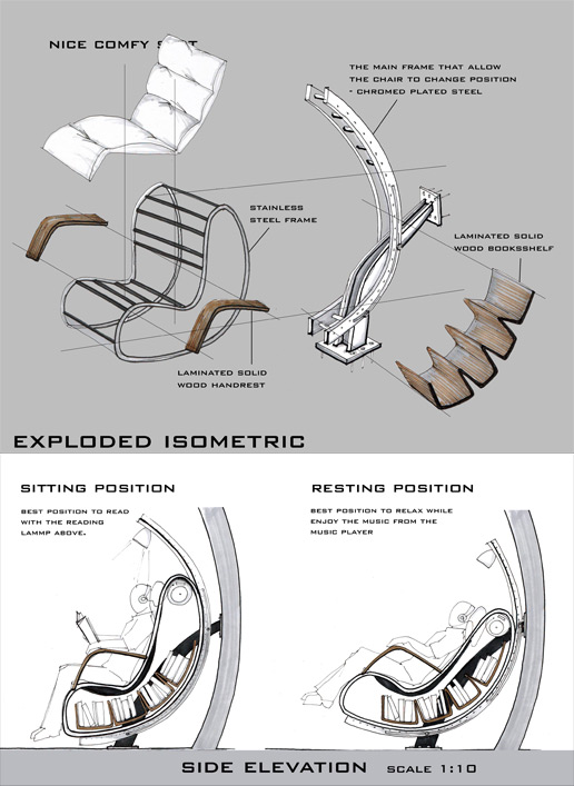
What is more important in furniture design? Aesthetics? Or is it the function and comfort? Well we all want the best of both worlds. This concept chair seems to deliver both.
This chair set up is for relaxing by reading or listening to music and has two different positions which provide adequate comfort for both. The chair is composed of a metal frame with leather straps and a cushion on top of those straps. It has two wooden arm rests and underneath it even has a bookcase and speakers to further functionality. It is attached to a metal frame that curves over the top of you to attach a lamp for reading purposes for optimal lighting.
I would love to own this chair. Recently I've been reading on ergonomics of chairs and this chair seems to fill all of the functions that would qualify for a great relaxing chair.
I also wouldn't be ashamed to have this recliner in my houe either. It doesn't seem large and bulky or like an eye sore. It has a neutral color scheme and different materials to match any decor. I would love to see this chair come into production. It would be the last chair anyone would need to buy.
Open House

This house was actually a contestant in the 2006 BDAA National Design awards. The BDAA is the Building Designs Association of Australia.
This house was designed by Tony Lawson of Lawson design. The idea of this house was to create a tropical house that was small and very open. The couple that wanted the house designed wanted an open environment so they could see the rain forest views and bird life that comes with the vegetation of the area. The house had a few requirements like that of being open, a concrete driveway, garage and workshop, a home office, and a place for occasional visitors.
The house carries a large appearance without being overly large. It has clean sweeping lines and very high levels of detail. I love the idea of an open house like this one. I am also never one for too large of houses. You need what you need and that is it, especially if you do not have children like the couple that wanted this house designed. I feel that you would really get the tropical experience with this house, it is in between the beach and a rain forest. There is nothing more beautiful than a beautifully designed house in some of natures most beautiful sites.
GM
After recently talking about logos that stand the test of time I think that this logo holds up the best. General Motors has been around since 1908 and start out as a holding company for Buick and later acquired Cadillac, Elmore, Oakland, and the Rapid Motor Vehicles Company. GM was then bought by the William G. Durant who started Chevrolet after he lost control of GM initially in 1910.
General Motors has been a staple in America since the early 1900s. This logo has been around since then. The GM logo has stood the test of time simply because it is a simple design with no reason to change. There are few automobile companies that do change their logo designs but, that is simply because they brand their cars with it. Until recently GM has started putting small "GM" brand tabs on the front fenders of their cars. The logo has proven that it is in fact timeless and based on the most simple of designs. I like the logo. Bold font, simple background. It is attention grabbing without being obnoxious and you've grown up with it around your whole life. No reason to change now.
Campbells

Campbell's soup. I'm not addressing Andy Warhol in this post just the label of the soup can. The Campbell's soup can is definitely iconic. If it wasn't a staple of grocery stores then it was in the modernist movement with Andy Warhol. The design is fairly simple and everyone recognizes it so why change it now? My problem with the soup label is that all of their labels look the same. I realize that you need to have a familiar face for customers but sometimes it is hard to tell them apart. There have been numerous times when I've picked up the wrong can of soup because they all look the same. If I were making products for consumers I would try my best to differentiate the products by their labels. I'd keep the same logo so they knew but maybe change up the red and white scheme to different colors for every type of soup. Cream of Mushroom could be Orange and white. If you keep the seal and font everyone will recognize that it is Campbells. Otherwise I like the design and I like companies that their logos stand the test of time.
Monday, November 23, 2009
Caliper Radio

This is a caliper style AM/FM radio. It was created by Mikael Silvanto. I like this design a lot. It seems simple and it merely a concept. I am honestly astounded that something like this hasn't been thought of or created already. This works almost like the dial to find the right frequency on a radio station on analog stereos, as well as a caliper for those who have used one before, for those who haven't a vernier caliper is a device used to measure the distance between two symmetrical sides. It is generally used for more precise measuring. Also it is like a vernier scale, the scales used at doctors offices and the like. This unit has a speaker with a dial that you can change frequencies between AM and FM stations. All you have to do is move the speaker unit up and down the scale to find the radio station you would like to listen to. The design is genius and compact. I suppose room for an antenna would benefit the design because in the house sometimes signal is at a loss for radio. That would be a future improvement I would see on this before it went to production.
Lunarglide

The new Nike LunarGlide. Where to start? This is Nike's future of running shoes. The initial design of the shoe starting with the look is a great design, it is light and non bulky. The orange sole might draw a little too much attention and the Men's version is black and orange and reminds me a little too much of Halloween. I'd still buy them though if not for the color schemes but for their functionality which is more than I have ever seen in a running shoe. Nike created this shoe in mind that every single runner is different, but they all crave the same thing: great comfort and fit, long-lasting cushioning, a smooth ride, and an appropriate level of support. To satisfy this requirement Nike created a multi-level support called "Dynamic Support." This system instantaneously adapts to every foot, whether male or female, big or small. It adapts to if you need more support early or at the end of the run, whenever. It is truly genius. It adapts for each individual run, each step, each foot. Everything. The design of this shoe goes far beyond stitching, the sole is comprised of microsynthetic overlays that are placed in specific places and not everywhere and are ultrasonically welded to the shoe to eliminate irritation to the foot. The new Nike LunarGlide is the future of running.
For more info you can read Nikes Website: http://inside.nike.com/blogs/nikerunning_news-en_US/2009/07/09/dynamic-support-no-compromise-needed
Sunday, November 22, 2009
PSP

Video game advertising has been a more recent form of media advertised lately. Lately being the last 10 years. Obviously there have been advertisements for video games before then but they were generally aimed towards one or two demographics. Ads were generally placed in comics or magazines that those likely to play video games would read. Video games recently have grown into a multi-million dollar industry. This has led to a growth in different types of advertising for the makers of video games. The Sony Playstation Portable prides itself on being a mobile media center. The creation of UMD discs, which are the medium for which the PSP gets its games, also helped the film industry by being able to put motion pictures on these discs. That is where this PSP advertisement comes into play. The billboard is of an actual PSP with a background picture that looks as if it clear. The advertisement is genius because it uses the real world as its background and puts a fictional character in it. It gives people a different sense of reality and I think helps captivate the audience. I could see other companies do this in the future, especially companies with mobile devices. These types of ads really speak to people. I enjoy every bit about this ad. It almost makes me want to go out and buy a PSP. This is a "cool" looking advertisement so it MUST be selling a "cool" product and I believe that's the image they are trying to send across to kids especially to try and get the new "cool" product.
Light Bulb

I'm a sucker for creatively designed billboards. Plain and simple. The idea of advertising in general, however, seems to be a give and take relationship. Billboards obviously consume energy and space, therefore not being that great for the environment. On the other hand environmentalists can also use advertising for their own needs. Advertisements help get ideas out and words across to the public. Where do you draw the line for what is better? It goes like the old saying, "you have to break an egg to make an omelet." Is it alright then to use perhaps billboard or television advertising for greener purposes but at that heart you are in fact helping to waste electricity and energy that could be put to better uses. This billboard is condoning the use of electricity and resources to get across the idea to use electricity more effectively. Eskom makes a valid argument showing that they don't need to use all of the space or electricity on this billboard to get their point across and that you can use less lights or electricity in general to get your work done or whatever it is you are doing. Do I think that this form of advertising for a greater cause is okay? Yeah I think so, sometimes one egg can mean a greater omelet for all of us.
Tuesday, November 17, 2009


At first glance this might seem pretty ridiculous. The thought of washing and a toilet don't go hand in hand. The green movement however has caught on. This toilet made by Caroma (http://caroma.com/) is one of the first designed toilets this way. There are attachments that are plastic that allow you to hook up a faucet to your existing toilet but Caroma is taking a greater design approach. According to Caroma this toilet can save a family of four around 30,000 gallons of water per year. How much water is that exactly? Well enough to fill most above ground pools. By now you may be asking yourself how does it work? Fresh water is used first for washing your hands and then flows into the cistern which is used to flush the toilet. Why would you flush your toilet with water that is able to drink or wash yourself with? The concept might be hard to accept but, this is the future. Design has to take on a new edge than before, companies cannot simply make a product look good, they also have to make it functional for the present and the future. The global movement towards greener communities is here and Caroma has a toilet for it.
Nissan Skyline GT-R 35
 The Nissan Skyline has been a long time favorite car of mine. Since its beginnings in the late 50s until the newest incarnation of this track-bred beast. This car is not just visually stunning but has some of the most futuristic technology combined in one machine. I won't necessarily get into the engine specifics because I want to focus on another important aspect of the car. The car is visually stunning. It looks as if it were cut with a knife. The looks also have great aerodynamic properties. It cuts through the air like a knife through butter while utilizing the air itself to create down force in the front and rear of the car to hold it down to the ground at high speeds. Everything on the car from the spoiler to the side view mirrors are from years of research in aerodynamics. This car also has a rear diffuser which helps air from underneath the car escape instead of getting caught up in the rear bumper, giving it less drag. The design of the whole car itself is a complete masterpiece.
 For more info look at : http://www.gtrnissan.com/en/web_GTR/homepage/index.html
Sunday, November 15, 2009
Creative Advertisements. 2

Here is another advertisement that really jumps out of the box. This is a Bic razor advertisement. This advertisement doesn't need a lot of flash or bright colors on the billboard to catch your eye. It simply shows a razor in action and sometimes the most eye popping billboard is one that is completely blank. I have a few thoughts on this advertisement. Advertising is very expensive in the first place, depending on the size of the billboard and where it is located companies can pay thousands of dollars a week to advertise on a billboard. This billboard advertisement doesn't have much on the billboard at all and they are having to pay to upkeep their billboard. This ad doesn't hold much water without constant grooming of the grass in front of it. I like the idea of it but not the practicality of the ad.
Creative Advertisements.

I think that the American public could be tired of boring advertisements. Ad agencies now more than ever need to go above and beyond to create a captivating advertisement. Most of the outrageous ads however, generally come from other countries. This Lego advertisement comes from Chile. The ad obviously represents real world building with the Lego blocks. This ad isn't necessarily to push a new product. It seems like the ad is a simple reminder. That Lego is still around. Sometimes those are the best kinds of ads. Everyday you see companies trying to push their newest product, while Lego is just pushing their company in general and a lot of times that is all it takes.
The Voodoo
 This has got to be the most interesting knife block I have ever seen. The knife block titled 'The Voodoo' is a design by Raffaele Iannello. Raffaele Iannello is an industrial designer as well as furniture and graphic designer. Industrial design has to be one of my favorite types of designs. Industrial design is the combination of applied art and applied science, whereby the aesthetics and usability of mass-produced products may be improved for marketability and production. This design really jumps out at you. It is definitely different from any other knife block you've ever seen. Made of ABS plastic the knives are held in place by magnets, so this knife block is as functional as it is aesthetically pleasing. It comes in a number of different colors, from black to silver to pink. I chose to show you the red one because I feel it makes the most impact. The spin this designer took on a dull knife block is directed toward a younger demographic and I feel is a staple of a post-modernist movement that we are in today.
 To see more designs from Raffeale Iannello go to his website at: http://www.dexigner.com/jump/directory/5718
Wednesday, November 4, 2009
Guitar Finishes

Guitar makers (luthiers if you will) will agree that for a guitar the best finish is no finish at all. Many musicians have either stripped their guitars down or have had their finish worn off with no intentions of refinishing it. The Beatles John Lennon stripped down an Epiphone Casino that was given to him because you get a more pure sound out of it. Rory Gallagher also carried a worn down to wood 61' Fender Stratocaster. Now how some people would like the look of a relic'd guitar or a bare wood one, they are suseptable to moisture, dirt, and oil. Now dirt and oil won't exactly break a guitar but, could hinder the natural beauty of the unfinished wood. There are also beautiful finishes from the "French Polish," which is where numerous coats of varnish are applied to the wood. There are also laquer finishes and more recently used a polyester resin finish. The polyester resin is the most inexpensive finish but, has probably the longest durability. So which one do you choose? The design aspects of these different finishes on guitars could be what you look for in your guitar. Do you choose one more for better sound? or for better looking? Personally, I like the unfinished guitars with perhaps a little bit of oil on them. I like the function of the better sound and I think that the bare wood is beautiful. Also I enjoy the look of an aged guitar, which a bare wood guitar looks more like. The more use and age your guitar has the more "you" it is and that is what I look for in a lot of designs. How can you make this design a part of you? I believe that designers that make their designs a part of them are some of the best designs. This could be as simple as the interior design of your house or as complex as a trying to find an automobile that speaks to you as an individual. Me? I'll take a worn guitar with chips and cracks and no paint.
Furniture, Bauhaus.

We've talked about the Bauhaus in class before so I figured I would look further into what they were and what they did. The Bauhaus school was founded by Walter Groupier in Weimar. In spite of its name, and the fact that its founder was an architect, the Bauhaus did not have an architecture department during the first years of its existence. Nonetheless it was founded with the idea of creating a 'total' work of art in which all arts, including architecture would eventually be brought together. The Bauhaus style became one of the most influential currents in Modernist Architecture and modern design. One of the most influential designers in the Modernist movement was a student and then teacher at the Bauhaus, Mercel Breuer. Mercel Breure designed the first bent steel chair later named the 'Wassily.' Part of the theory of the chair is the idea that as humans we should not conform to our furniture but, it should conform to us. The chair was fairly simple in form. It was merely straps of fabric stretched across the chair for the back, seat, and arms. The bent steel was hard to come by at the time of its conceptual design in the early 1920s because of how steel tubes had been manufactured up to that point. The chair which was created more than 90 years ago because of its design and modern appeal has been remanufactured by many different producers still this day. I believe this chair has lived on so well because of its timeless and simple design. The lack of fabric makes it easy to flow and fit with almost any decor. The functionality of the chair is what catches me. It is simple to clean, and looks fairly comfortable. You might not sink into the chair like a lazy boy but it also looks a lot better than one also.
For more information on the Bauhaus: http://en.wikipedia.org/wiki/Bauhaus
Wassily Chair: http://en.wikipedia.org/wiki/Wassily_Chair
Mercel Breur: http://en.wikipedia.org/wiki/Marcel_Breuer
Automobile Design.

Carrying over from the last post on design, is form follows function. The design of automobiles is where this design philosophy is most apparent. There have been cars that have been marvelous (in a manner of speaking) to look at but the designs of the engine, suspension, and similar components were terrible. In automobile design is can be more apparent where the phrase "form follows function" is. Sports cars generally carry this trait better than most other cars. The way that Ferrari designs its cars, it does not just throw a large engine into whatever car they can create. The design of the looks of the car are engineered to conform to its function. They use aerodynamic shapes to create downforce to hold the car down on a track or they create a wide stance for better vehicle dynamics. Obviously there is a price involved for cars where form follows function. At least where every single aspect of the car revolves around eachother. Another good example to look at is hybrid electric cars like the Toyota Prius or Honda Insight. These cars are very aero dynamic to create as little wind resistance as possible. The original model of the Honda Insight covers the rear wheel wells to have less drag from wind catching in the back of the vehicle.
In my mind form should always follow function. Whatever product you create it should form to the original function of the product. The better the function of any product the greater its form will ultimately be. Even if it could look worse than a model along the similar lines of what it is.
To read more on form follows function here is the wiki article:
http://en.wikipedia.org/wiki/Form_follows_function
Design.
According to Wikipedia, design is the planning that lays the basis for the making of every object or system. In the article it states that design has almost unlimited possibilities for what it can be. It is used in everyday life. Everything man made that we see, feel, smell, hear. It is all a concept of design. There are many different forms of design and ways to approach it. My favorite type of design is that function beats form. Simply meaning that a product should work as well or better than it looks. I realize that there is ,however, a place for more form than function, i.e. with art. In this day and age art's only purpose is to be aesthetically pleasing and used as a means for expression. Before art was mainly used to recreate history through the eyes that have seen it or as a visual representation of what some people imagine a scenario could have looked like throughout history. Most artwork that was pre american culture is almost all religious based. I was recently at the Indianapolis Museum of Art and they have an exhibit called "Sacred Spain" which is about Spanish art that was based around Jesus Christ. Art has always surrounded every single culture you can imagine. From cave drawings to multimedia masterpieces like the opening ceremony for the 2008 Summer Olympics, art and design have been around and it always will be, that is as long as humans go on to exist.
Sunday, October 11, 2009
Nissan 370z Webpage
 As I have state before I am a car hobbyist and all around gear head in general. This is the title web page for building a 2010 Nissan 370z. I have scrolled through many car web pages and the designs of most of them are more interactive than this one. Generally the ads have a lot cleaner set ups than this website does. I like the use of the yellow 370z with a rather plain background. It makes the car the center of attention, which it needs to be. The text is all rather plain though, as well as the menu options. If you're showcasing one of your sports cars you would think you would want your web page to reflect what the sports car is, in the form of a website. I do not feel Nissan has accomplished this at all. I just feel the website is very plain and a leftover site in the sense that it doesn't look very new or updated for this new car. As I said before, the website should reflect the idea of an open road, fast, sexy, sleek but, it does not and this is why I feel the website fails as an advertisement for selling this car.
3-D Billboards

I have a thing for 3-d billboard advertisements. This is the second one I have found and I think that they are fantastic. You can use simple colors and no backgrounds and if they are 3-d they are more eye catching than 2-d ones. This billboard for instance is a picture of a man biting off a section of the billboard itself. There is no background, no flashy eye popping colors. There is just a man and a white background and yet I still feel this is more distracting (in a good way) than perhaps a bright red billboard. As I have stated before I feel that humans or at least Americans can be bored with generic visual advertisements. It has been around for a long time and we have all seen everything that anyone can try. I thoroughly enjoy when advertisers break out of the mundane normal shell and create works of 3-d art to capture our attention, it is truely phenomenal.
Wednesday, October 7, 2009
Ultra Modern Sinks


The first glance of these pictres you may just want to keep staring and try to figure out what they are. It took me a few seconds to realize actually what I was looking at. If you haven't figured it out by now these are all ultra modern styled sinks designed by Bagno Bandini designs. I ,for one, am a fan of modern designs. I find them almost timeless. A lot of modern designs seem to be stemmed from designs of the 60s, because they are very curvacious and have basic solid colors. Some of these designs are referred to as retrofuturistic looks. Although aesthetically more pleasing than most sinks, the functionality of these sinks seems to be very limited. The shallow depth of the sinks seem as if they wouldn't keep higher pressure water from splashing out very well. I enjoy the looks of modern furniture as well as appliances and house wares but I enjoy function over form also. These sinks do look good but, I would be sure to try to test them before buying, in the event that there is more than one set and they are being sold to consumers. I have not found a pricetag for a set of sinks like the ones mentioned above but I'm assuming that they are going to be more for show than purpose anyway, considering those that could afford sinks like this, generally would put them in a bathroom not used for everyday needs. I'd give an A for design and a C for function.
I found these sinks here http://dornob.com/brilliant-curved-basins-and-super-smooth-sink-surfaces/
Friday, October 2, 2009
J. Bannon
 This piece of artwork is titled "Jane Doe" it is by the artist Jacob Bannon. Jacob Bannon has been an artist since he was 13 years old and has designed and created many works of art for album covers and webpages for many bands. He is also the lead singer and founder of the band "Converge." More information on Jacob Bannon can be found on www.jacobbannon.com.
This piece of work is probably one of my favorite piece by Jacob Bannon. I love his use of many layers. I enjoy the dull color schemes behind the main focus of the image, which is the girl in the middle of the picture. Much of his art is comprised of many many layers of silk screens. This particular image is the cover of Converge's CD titled "Jane Doe." The best part of his artwork is that he manages to use many layers without the images looking cluttered, unless it is intentional. The style this image was created in makes it seem almost like an ancient picture. It almost looks like there is a sun behind her head. You notice design elements from perhaps ancient Egyptian era and styles. I encourage you to look at more of his designs because they are truly remarkable.
Tattoo Ads.


When you think about tattoos you simply think about works of art or memorials that have a symbolic meaning to the person that is getting the tattoo. How often do you think about permanent advertisements as tattoos? For me it was not at all, however, I do recall earlier in the decade people were starting to sell parts of their bodies on ebay for businesses to tattoo ads on them. I have researched a little bit and found websites like www.leaseyourbody.com who puts temporary tattoos on your for money and this article on "walking billboards" on msnbc http://www.msnbc.msn.com/id/21979076/.
The pictures I posted may not necessarily look like a traditional tattooed advertisement. It looks legitimately like a work of art that someone would have gotten tattooed on them because they could be in love with Volkswagen beetles. In all reality it is an ad for lo/jack. The security company that installs GPS devices on items to help track and find them. Usually used for automobiles. http://www.lojack.com/ is the website you can find out more information on them. They are taking advertising into a whole new level by not just creating a beautiful ad but, also by stepping over boundaries as where you can advertise. It is truly unique. They are one of the only mainstream companies I have seen with very artistic tattoos and all out great designs and that are utilizing the walking billboard. Dunlop tires also had a promotion that if you got a logo of their "D" tattooed on your body you would get a free set of tires. I'm not sure how much those that have the lo/jack tattoos were compensated for their "billboard space" but, I'm sure it was more than a set of new tires. Some people just love tattoos for the sake of having them and if you can get a free tattoo and some money out of it and do not really care what the tattoo is then why not?
The design itself I feel is beautiful, I am are car hobbyist so any type of artistic rendering of an automobile I usually love. I also enjoy tattoos and see most of them as works of art, at least custom drawn ones. I like the simplicity of just using a gray scale and not using any colors. I feel it stands out more that way rather than fading out.
Wednesday, September 23, 2009
Hot Box Pizza

 I enjoy the hotbox pizza logo a lot. Simply because it is a fairly simple logo. I like the fact that it is black and white I feel that they realize there is no need to have a complex logo. It is straight to the point. I'm sure that hot box does also have a colored version of their logo but I believe it is just the flames that are colored then. It is still a simple design but it gets it idea across very easily. A box around the lettering that is on fire, theres not much more that is needed to be said. I wanted to look and see if there were any other companies that use more plain colored logos and the only company logo I could find was a Canadian railway logo. I believe this is used as a type of postal service in Canada. I feel as if this logo if it had color could take away from the simple design of it. Obviously color makes logos more popping and catch your attention but, with these logos I feel as if they grab my attention just as well as if they had color because of the designs used.
Friday, September 18, 2009
The Cadillac of Ads
 I am a big car hobbyist and fan. This probably will not be my only post pertaining to a car design or a website of an automotive manufacturer or even an advertisement of a car. This image is almost breathtaking as to how good it looks for as simplistic as it is. Its a Red CTS with a black background and the words "Cadillac" written behind it, add some lighting effects and you've got an astounding visual image of a car ad. The first thing that rings to mind is how classy the image looks as a whole, which in turn makes you think of how the car is a luxury car in the first place so you wouldn't expect any less. If they had added any more to the image like a background it would have ruined the design of the whole layout. Knowing when enough is enough (even when you didn't ad any other image) is probably one of the best things to learn as a designer. If you can get your design across and captivate everyone who sees it, without any kind of attention grabber besides that of the design of the whole or of the product itself, then you are doing a fantastic job.
Wednesday, September 16, 2009
Mini 9/16/09
 I stumbled across this ad in a car forum that someone posted about it. I'm not sure where the origin of this advertisement is but it is catching. It seems like the basis of this advertisement is to "think outside the box" but while being in a box. The tagline "it's more fun in a mini" seems to imply that this car is somewhat of a toy (as does the rest of the packaging). This ad campaign could bring up a nostalgic feeling of when you're a kid and you remember going to the store to get a new toy of some sort and it came in packaging just as this mini does. The ad is a head turner but it is not very practical. I doubt you would see a mini in a toy package in every mall in every major city. Its not very economical and you're still not reaching that broad of a demographic. Unless you turned this ad in a television commercial you would have trouble reaching a lot of the public which is why the ad could fail. A for inginuity C for practicality.
Subscribe to:
Posts (Atom)
