Wednesday, November 25, 2009

Power Mat


I saw one of these at Target the other day and they seem pretty remarkable. It charges your mobile devices wirelessly. It can charge 3 devices at once but, only mainly Iphones and Blackberry devices. One of the major drawbacks is that you have to get devices like cases with the charger in them to activate the board. I believe the board was around $100 and then each case was $40. I don't think that the cost of this product outweighs what it actually does. It is a cool product because it can wirelessly charge products but, its not practical.

Nissan Leaf


The green movement is not slowing down, this movement has finally snowballed into a global awareness and the sooner automakers embrace this fact and put cars out in their line greater than even hybrid half gas half electric, then we will really be making great steps. The Nissan Leaf is the newest car by the automaker Nissan. It is an all electric vehicle similar to the Chevrolet Volt. It is 100% electric and has no emissions. Nissan claims that the Leaf will do up to 90 MPH and accelerates off the line similar to a V6 gasoline engine. Sounds promising to me. It drives around 100 Miles per drive under everyday driving conditions. It is rumored to cost around what other typical family sedans cost. The leaf can charge in 4-8 hours on a 220v Home charging unit and there will be "quick charge" stations that I'm assuming you can park your car at that can charge 80% in 26 minutes.

The car itself looks good, it doesn't seem bulky or any different from any other car on the road. I Enjoy the hatchback design of it for space purposes and all around. If this car is competitively priced I can't see dealers being able to keep this car on their lots with the current gas crisis state.

Demolicion


This is an advertisement campaign by a magazine called "Demolicion" They are an extreme sports magazine. To promote extreme sports they started putting surfboards on walkways and escalators. The surfboards basically give the riders of the escalators and walkways something else to do. It isn't necessarily a simulation, it is just something fun to act like you're riding on it up or down the stairs. This reminds me of the Volkswagen musical stair set that we watched in class. Creative ads like this sometimes capture an audience and the audience doesn't even realize it. It is used just to get their name out there in a new and unusual way.

Peta pushing the boundry


There is a saying that is "sex sells." This has got to be one of the most abundant forms of that saying. They are not even selling an product, they are selling a belief in not killing animals for fashion. Now these ads definitely get your attention, it doesn't matter who you are or what demographic you are. If you see a naked person its almost human nature just to look. This especially appeals to the male crowd, obviously men are going to look at a beautiful girl on an ad. The only problem with selling sex is that you just sell sex, how often does anyone actually know what product is being promoted when you put words next to a beautiful naked woman, where are your eyes going to be drawn to. I enjoy PETAs ads however, because they are not trying to push a product. They are simply standing up for what they believe in and I think that it is great. They have the ability to capture audiences by whatever is necessary, they have light hearted ads like this advertisement and they are also known for having the human sized packages of meant with naked people in them covered in blood. You capture attention regardless of the route you choose but I think PETA has one of the greatest advertising campaigns there are and it is the only way they will get their word out in a consumer based society as our own.

Furniture Design Part 2

Keeping on my current theme of furniture design this is truly unique. This is a table set with two chairs that completely folds or hands onto the wall. Talk about space saving. This is great for those who have small apartments or homes. The color of the furniture almost looks raw so you could paint or stain it any color you'd like. The simple design is a more modern take on furniture with bold lines and squared off edges. I always enjoy functional furniture. Not something that just looks pretty. This furniture can save you space and still look good.

Furniture Design.


What is more important in furniture design? Aesthetics? Or is it the function and comfort? Well we all want the best of both worlds. This concept chair seems to deliver both.

This chair set up is for relaxing by reading or listening to music and has two different positions which provide adequate comfort for both. The chair is composed of a metal frame with leather straps and a cushion on top of those straps. It has two wooden arm rests and underneath it even has a bookcase and speakers to further functionality. It is attached to a metal frame that curves over the top of you to attach a lamp for reading purposes for optimal lighting.

I would love to own this chair. Recently I've been reading on ergonomics of chairs and this chair seems to fill all of the functions that would qualify for a great relaxing chair.

I also wouldn't be ashamed to have this recliner in my houe either. It doesn't seem large and bulky or like an eye sore. It has a neutral color scheme and different materials to match any decor. I would love to see this chair come into production. It would be the last chair anyone would need to buy.

Open House


This house was actually a contestant in the 2006 BDAA National Design awards. The BDAA is the Building Designs Association of Australia.

This house was designed by Tony Lawson of Lawson design. The idea of this house was to create a tropical house that was small and very open. The couple that wanted the house designed wanted an open environment so they could see the rain forest views and bird life that comes with the vegetation of the area. The house had a few requirements like that of being open, a concrete driveway, garage and workshop, a home office, and a place for occasional visitors.

The house carries a large appearance without being overly large. It has clean sweeping lines and very high levels of detail. I love the idea of an open house like this one. I am also never one for too large of houses. You need what you need and that is it, especially if you do not have children like the couple that wanted this house designed. I feel that you would really get the tropical experience with this house, it is in between the beach and a rain forest. There is nothing more beautiful than a beautifully designed house in some of natures most beautiful sites.

GM


After recently talking about logos that stand the test of time I think that this logo holds up the best. General Motors has been around since 1908 and start out as a holding company for Buick and later acquired Cadillac, Elmore, Oakland, and the Rapid Motor Vehicles Company. GM was then bought by the William G. Durant who started Chevrolet after he lost control of GM initially in 1910.

General Motors has been a staple in America since the early 1900s. This logo has been around since then. The GM logo has stood the test of time simply because it is a simple design with no reason to change. There are few automobile companies that do change their logo designs but, that is simply because they brand their cars with it. Until recently GM has started putting small "GM" brand tabs on the front fenders of their cars. The logo has proven that it is in fact timeless and based on the most simple of designs. I like the logo. Bold font, simple background. It is attention grabbing without being obnoxious and you've grown up with it around your whole life. No reason to change now.

Campbells


Campbell's soup. I'm not addressing Andy Warhol in this post just the label of the soup can. The Campbell's soup can is definitely iconic. If it wasn't a staple of grocery stores then it was in the modernist movement with Andy Warhol. The design is fairly simple and everyone recognizes it so why change it now? My problem with the soup label is that all of their labels look the same. I realize that you need to have a familiar face for customers but sometimes it is hard to tell them apart. There have been numerous times when I've picked up the wrong can of soup because they all look the same. If I were making products for consumers I would try my best to differentiate the products by their labels. I'd keep the same logo so they knew but maybe change up the red and white scheme to different colors for every type of soup. Cream of Mushroom could be Orange and white. If you keep the seal and font everyone will recognize that it is Campbells. Otherwise I like the design and I like companies that their logos stand the test of time.

Monday, November 23, 2009

Caliper Radio


This is a caliper style AM/FM radio. It was created by Mikael Silvanto. I like this design a lot. It seems simple and it merely a concept. I am honestly astounded that something like this hasn't been thought of or created already. This works almost like the dial to find the right frequency on a radio station on analog stereos, as well as a caliper for those who have used one before, for those who haven't a vernier caliper is a device used to measure the distance between two symmetrical sides. It is generally used for more precise measuring. Also it is like a vernier scale, the scales used at doctors offices and the like. This unit has a speaker with a dial that you can change frequencies between AM and FM stations. All you have to do is move the speaker unit up and down the scale to find the radio station you would like to listen to. The design is genius and compact. I suppose room for an antenna would benefit the design because in the house sometimes signal is at a loss for radio. That would be a future improvement I would see on this before it went to production.

Lunarglide


The new Nike LunarGlide. Where to start? This is Nike's future of running shoes. The initial design of the shoe starting with the look is a great design, it is light and non bulky. The orange sole might draw a little too much attention and the Men's version is black and orange and reminds me a little too much of Halloween. I'd still buy them though if not for the color schemes but for their functionality which is more than I have ever seen in a running shoe. Nike created this shoe in mind that every single runner is different, but they all crave the same thing: great comfort and fit, long-lasting cushioning, a smooth ride, and an appropriate level of support. To satisfy this requirement Nike created a multi-level support called "Dynamic Support." This system instantaneously adapts to every foot, whether male or female, big or small. It adapts to if you need more support early or at the end of the run, whenever. It is truly genius. It adapts for each individual run, each step, each foot. Everything. The design of this shoe goes far beyond stitching, the sole is comprised of microsynthetic overlays that are placed in specific places and not everywhere and are ultrasonically welded to the shoe to eliminate irritation to the foot. The new Nike LunarGlide is the future of running.

For more info you can read Nikes Website: http://inside.nike.com/blogs/nikerunning_news-en_US/2009/07/09/dynamic-support-no-compromise-needed

Sunday, November 22, 2009

PSP


Video game advertising has been a more recent form of media advertised lately. Lately being the last 10 years. Obviously there have been advertisements for video games before then but they were generally aimed towards one or two demographics. Ads were generally placed in comics or magazines that those likely to play video games would read. Video games recently have grown into a multi-million dollar industry. This has led to a growth in different types of advertising for the makers of video games. The Sony Playstation Portable prides itself on being a mobile media center. The creation of UMD discs, which are the medium for which the PSP gets its games, also helped the film industry by being able to put motion pictures on these discs. That is where this PSP advertisement comes into play. The billboard is of an actual PSP with a background picture that looks as if it clear. The advertisement is genius because it uses the real world as its background and puts a fictional character in it. It gives people a different sense of reality and I think helps captivate the audience. I could see other companies do this in the future, especially companies with mobile devices. These types of ads really speak to people. I enjoy every bit about this ad. It almost makes me want to go out and buy a PSP. This is a "cool" looking advertisement so it MUST be selling a "cool" product and I believe that's the image they are trying to send across to kids especially to try and get the new "cool" product.

Light Bulb


I'm a sucker for creatively designed billboards. Plain and simple. The idea of advertising in general, however, seems to be a give and take relationship. Billboards obviously consume energy and space, therefore not being that great for the environment. On the other hand environmentalists can also use advertising for their own needs. Advertisements help get ideas out and words across to the public. Where do you draw the line for what is better? It goes like the old saying, "you have to break an egg to make an omelet." Is it alright then to use perhaps billboard or television advertising for greener purposes but at that heart you are in fact helping to waste electricity and energy that could be put to better uses. This billboard is condoning the use of electricity and resources to get across the idea to use electricity more effectively. Eskom makes a valid argument showing that they don't need to use all of the space or electricity on this billboard to get their point across and that you can use less lights or electricity in general to get your work done or whatever it is you are doing. Do I think that this form of advertising for a greater cause is okay? Yeah I think so, sometimes one egg can mean a greater omelet for all of us.

Tuesday, November 17, 2009


At first glance this might seem pretty ridiculous. The thought of washing and a toilet don't go hand in hand. The green movement however has caught on. This toilet made by Caroma (http://caroma.com/) is one of the first designed toilets this way. There are attachments that are plastic that allow you to hook up a faucet to your existing toilet but Caroma is taking a greater design approach. According to Caroma this toilet can save a family of four around 30,000 gallons of water per year. How much water is that exactly? Well enough to fill most above ground pools. By now you may be asking yourself how does it work? Fresh water is used first for washing your hands and then flows into the cistern which is used to flush the toilet. Why would you flush your toilet with water that is able to drink or wash yourself with? The concept might be hard to accept but, this is the future. Design has to take on a new edge than before, companies cannot simply make a product look good, they also have to make it functional for the present and the future. The global movement towards greener communities is here and Caroma has a toilet for it.

Nissan Skyline GT-R 35

The Nissan Skyline has been a long time favorite car of mine. Since its beginnings in the late 50s until the newest incarnation of this track-bred beast. This car is not just visually stunning but has some of the most futuristic technology combined in one machine. I won't necessarily get into the engine specifics because I want to focus on another important aspect of the car. The car is visually stunning. It looks as if it were cut with a knife. The looks also have great aerodynamic properties. It cuts through the air like a knife through butter while utilizing the air itself to create down force in the front and rear of the car to hold it down to the ground at high speeds. Everything on the car from the spoiler to the side view mirrors are from years of research in aerodynamics. This car also has a rear diffuser which helps air from underneath the car escape instead of getting caught up in the rear bumper, giving it less drag. The design of the whole car itself is a complete masterpiece.

For more info look at : http://www.gtrnissan.com/en/web_GTR/homepage/index.html

Sunday, November 15, 2009

Creative Advertisements. 2


Here is another advertisement that really jumps out of the box. This is a Bic razor advertisement. This advertisement doesn't need a lot of flash or bright colors on the billboard to catch your eye. It simply shows a razor in action and sometimes the most eye popping billboard is one that is completely blank. I have a few thoughts on this advertisement. Advertising is very expensive in the first place, depending on the size of the billboard and where it is located companies can pay thousands of dollars a week to advertise on a billboard. This billboard advertisement doesn't have much on the billboard at all and they are having to pay to upkeep their billboard. This ad doesn't hold much water without constant grooming of the grass in front of it. I like the idea of it but not the practicality of the ad.

Creative Advertisements.


I think that the American public could be tired of boring advertisements. Ad agencies now more than ever need to go above and beyond to create a captivating advertisement. Most of the outrageous ads however, generally come from other countries. This Lego advertisement comes from Chile. The ad obviously represents real world building with the Lego blocks. This ad isn't necessarily to push a new product. It seems like the ad is a simple reminder. That Lego is still around. Sometimes those are the best kinds of ads. Everyday you see companies trying to push their newest product, while Lego is just pushing their company in general and a lot of times that is all it takes.

The Voodoo

This has got to be the most interesting knife block I have ever seen. The knife block titled 'The Voodoo' is a design by Raffaele Iannello. Raffaele Iannello is an industrial designer as well as furniture and graphic designer. Industrial design has to be one of my favorite types of designs. Industrial design is the combination of applied art and applied science, whereby the aesthetics and usability of mass-produced products may be improved for marketability and production. This design really jumps out at you. It is definitely different from any other knife block you've ever seen. Made of ABS plastic the knives are held in place by magnets, so this knife block is as functional as it is aesthetically pleasing. It comes in a number of different colors, from black to silver to pink. I chose to show you the red one because I feel it makes the most impact. The spin this designer took on a dull knife block is directed toward a younger demographic and I feel is a staple of a post-modernist movement that we are in today.

To see more designs from Raffeale Iannello go to his website at: http://www.dexigner.com/jump/directory/5718

Wednesday, November 4, 2009

Guitar Finishes


Guitar makers (luthiers if you will) will agree that for a guitar the best finish is no finish at all. Many musicians have either stripped their guitars down or have had their finish worn off with no intentions of refinishing it. The Beatles John Lennon stripped down an Epiphone Casino that was given to him because you get a more pure sound out of it. Rory Gallagher also carried a worn down to wood 61' Fender Stratocaster. Now how some people would like the look of a relic'd guitar or a bare wood one, they are suseptable to moisture, dirt, and oil. Now dirt and oil won't exactly break a guitar but, could hinder the natural beauty of the unfinished wood. There are also beautiful finishes from the "French Polish," which is where numerous coats of varnish are applied to the wood. There are also laquer finishes and more recently used a polyester resin finish. The polyester resin is the most inexpensive finish but, has probably the longest durability. So which one do you choose? The design aspects of these different finishes on guitars could be what you look for in your guitar. Do you choose one more for better sound? or for better looking? Personally, I like the unfinished guitars with perhaps a little bit of oil on them. I like the function of the better sound and I think that the bare wood is beautiful. Also I enjoy the look of an aged guitar, which a bare wood guitar looks more like. The more use and age your guitar has the more "you" it is and that is what I look for in a lot of designs. How can you make this design a part of you? I believe that designers that make their designs a part of them are some of the best designs. This could be as simple as the interior design of your house or as complex as a trying to find an automobile that speaks to you as an individual. Me? I'll take a worn guitar with chips and cracks and no paint.

Furniture, Bauhaus.


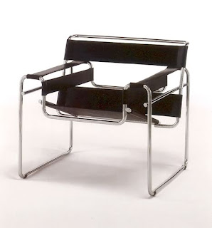
We've talked about the Bauhaus in class before so I figured I would look further into what they were and what they did. The Bauhaus school was founded by Walter Groupier in Weimar. In spite of its name, and the fact that its founder was an architect, the Bauhaus did not have an architecture department during the first years of its existence. Nonetheless it was founded with the idea of creating a 'total' work of art in which all arts, including architecture would eventually be brought together. The Bauhaus style became one of the most influential currents in Modernist Architecture and modern design. One of the most influential designers in the Modernist movement was a student and then teacher at the Bauhaus, Mercel Breuer. Mercel Breure designed the first bent steel chair later named the 'Wassily.' Part of the theory of the chair is the idea that as humans we should not conform to our furniture but, it should conform to us. The chair was fairly simple in form. It was merely straps of fabric stretched across the chair for the back, seat, and arms. The bent steel was hard to come by at the time of its conceptual design in the early 1920s because of how steel tubes had been manufactured up to that point. The chair which was created more than 90 years ago because of its design and modern appeal has been remanufactured by many different producers still this day. I believe this chair has lived on so well because of its timeless and simple design. The lack of fabric makes it easy to flow and fit with almost any decor. The functionality of the chair is what catches me. It is simple to clean, and looks fairly comfortable. You might not sink into the chair like a lazy boy but it also looks a lot better than one also.

For more information on the Bauhaus: http://en.wikipedia.org/wiki/Bauhaus
Wassily Chair: http://en.wikipedia.org/wiki/Wassily_Chair
Mercel Breur: http://en.wikipedia.org/wiki/Marcel_Breuer

Automobile Design.


Carrying over from the last post on design, is form follows function. The design of automobiles is where this design philosophy is most apparent. There have been cars that have been marvelous (in a manner of speaking) to look at but the designs of the engine, suspension, and similar components were terrible. In automobile design is can be more apparent where the phrase "form follows function" is. Sports cars generally carry this trait better than most other cars. The way that Ferrari designs its cars, it does not just throw a large engine into whatever car they can create. The design of the looks of the car are engineered to conform to its function. They use aerodynamic shapes to create downforce to hold the car down on a track or they create a wide stance for better vehicle dynamics. Obviously there is a price involved for cars where form follows function. At least where every single aspect of the car revolves around eachother. Another good example to look at is hybrid electric cars like the Toyota Prius or Honda Insight. These cars are very aero dynamic to create as little wind resistance as possible. The original model of the Honda Insight covers the rear wheel wells to have less drag from wind catching in the back of the vehicle.

In my mind form should always follow function. Whatever product you create it should form to the original function of the product. The better the function of any product the greater its form will ultimately be. Even if it could look worse than a model along the similar lines of what it is.

To read more on form follows function here is the wiki article:
http://en.wikipedia.org/wiki/Form_follows_function

Design.

According to Wikipedia, design is the planning that lays the basis for the making of every object or system. In the article it states that design has almost unlimited possibilities for what it can be. It is used in everyday life. Everything man made that we see, feel, smell, hear. It is all a concept of design. There are many different forms of design and ways to approach it. My favorite type of design is that function beats form. Simply meaning that a product should work as well or better than it looks. I realize that there is ,however, a place for more form than function, i.e. with art. In this day and age art's only purpose is to be aesthetically pleasing and used as a means for expression. Before art was mainly used to recreate history through the eyes that have seen it or as a visual representation of what some people imagine a scenario could have looked like throughout history. Most artwork that was pre american culture is almost all religious based. I was recently at the Indianapolis Museum of Art and they have an exhibit called "Sacred Spain" which is about Spanish art that was based around Jesus Christ. Art has always surrounded every single culture you can imagine. From cave drawings to multimedia masterpieces like the opening ceremony for the 2008 Summer Olympics, art and design have been around and it always will be, that is as long as humans go on to exist.